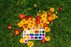
Color temperature is one of the most effective ways to influence how a painting is perceived.
Warm hues, including reds, oranges, and yellows, can create visual energy and prominence, while cool hues, including blues, greens, and violets, can suggest distance, calm, and openness.
Used deliberately, temperature differences help artists organize a composition without relying solely on outlines or detailed rendering. They can separate spatial planes, establish focal points, describe lighting conditions, and strengthen the overall atmosphere.
Understanding Color Temperature
Warm and cool are relative classifications rather than fixed properties of every individual color. Reds, oranges, and yellows are commonly considered warm, while blues, greens, and violets are generally considered cool. However, individual colors can shift in temperature depending on their mixture and surrounding colors.
This relative quality gives painters considerable flexibility. A warmer version of one hue can be placed beside a cooler version of the same hue to create subtle variation while maintaining color harmony.
Using Temperature to Build Depth
Color temperature can contribute to the perception of space. Warm areas may appear to advance, while cool areas may seem to recede. This effect is not automatic; it interacts with contrast, saturation, value, atmospheric conditions, and neighboring colors.
Artists can use these relationships to distinguish foreground, middle-ground, and background elements. A warmer subject against a cooler surrounding area, for example, can appear more prominent and reinforce spatial separation.
Directing Visual Attention
Temperature differences can guide the viewer through a composition. A concentrated warm accent within a predominantly cool area can create a strong focal point, particularly when supported by differences in value or saturation.
Cool passages can provide visual balance around areas of emphasis. They do not necessarily function as secondary elements; a cool color can become dominant when its contrast, intensity, or placement makes it visually prominent.
Creating Atmospheric Effects
Color temperature plays an important role in describing light and atmosphere. Warm illumination can suggest sunlight or other warm light sources, while cooler passages can help communicate shade, distance, or atmospheric space.
Temperature can also influence the emotional character of a composition. Warm combinations may create a lively or inviting impression, whereas cooler combinations can produce a quieter or more spacious effect. The surrounding palette and subject determine how these impressions are ultimately perceived.
Balancing Warm and Cool Relationships
Strong color organization often depends on the interaction between temperatures rather than the exclusive use of one palette. Warm and cool variations can be distributed across illuminated surfaces, shadows, fabrics, architecture, landscapes, and skies.
Shadows, for instance, can contain cooler or warmer influences depending on the light source and reflected colors in the environment. Introducing these subtle variations can give surfaces greater dimensionality and prevent large areas from appearing uniform.
Temperature shifts can also occur within a single hue. Different reds, blues, or greens may vary in warmth, allowing artists to create nuanced transitions without introducing unrelated colors.
Practical Application
When developing a painting, artists can begin by identifying the dominant temperature of the composition and then introducing controlled contrasts where greater emphasis is needed. A predominantly cool scene may benefit from a limited warm accent, while a warm composition can gain structure from carefully placed cool passages.
The strongest results usually come from intentional relationships rather than applying a simple rule that warm colors must advance or cool colors must recede. Observing the interaction of temperature, value, saturation, and surrounding hues provides greater control over the final appearance.
Warm and cool colors are fundamental tools for controlling visual relationships in painting. They can help establish depth, organize attention, describe illumination, and shape atmosphere while adding variety to the palette.
By treating color temperature as a relative relationship rather than a rigid formula, artists can make more precise decisions and create paintings with greater depth, balance, and visual coherence.