Color is one of the most powerful elements of visual art. Long before viewers recognize a subject or interpret a message, they often respond to color on an emotional level.
Artists have used color throughout history to communicate ideas, create atmosphere, and evoke feelings that words cannot always express.
While individual responses to color vary, research in color psychology suggests that colors can influence perception, mood, and emotional experience, making them an essential part of artistic expression.
What Is Color Psychology in Art?
Color psychology is the study of how colors influence human perception, emotions, and behavior. In the world of art, it helps explain why certain color combinations feel energetic, peaceful, dramatic, or nostalgic. Rather than following fixed rules, color psychology provides general principles that artists can use to strengthen visual storytelling. Personal experiences, cultural influences, and artistic context all contribute to how viewers interpret artworks.
Warm Colors and Emotional Expression
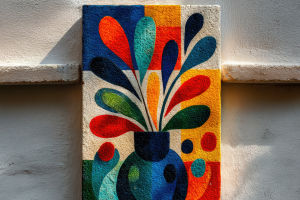
Warm colors, including red, orange, and yellow, are often associated with energy, passion, warmth, and optimism. Artists frequently use these colors to create visual excitement, attract attention, or emphasize important elements within a composition. Red can suggest intensity and strength, orange conveys enthusiasm and creativity, while yellow often represents brightness and hope. The emotional impact of these colors depends on their intensity, their relationship with surrounding colors, and the overall composition.
Cool Colors and Visual Harmony
Cool colors such as blue, green, and purple are commonly linked with calmness, balance, and reflection. Blue often creates a sense of tranquility and stability, while green is associated with nature, renewal, and harmony. Purple has long been connected with imagination, elegance, and artistic sophistication due in part to the historical rarity and value of purple pigments. Artists often use cool colors to establish peaceful atmospheres or encourage quiet contemplation.
The Importance of Neutral Colors
Neutral colors, including white, gray, beige, and black, provide balance within a work of art. White can create a sense of openness and simplicity, while black introduces contrast, depth, and visual emphasis. Gray contributes subtlety and refinement, and earthy neutral tones help unify compositions without competing for attention. These colors allow brighter hues to stand out while creating harmony throughout an artwork.
Color, Composition, and Creativity
Color becomes most effective when combined with thoughtful composition. Contrast, harmony, saturation, and color temperature all influence how viewers experience an artwork. Complementary colors can create energy and visual tension, while analogous colors often produce a softer and more unified appearance. By carefully balancing these relationships, artists guide the viewer's eye, establish rhythm, and create emotional depth within their work.
Color as a Creative Tool
Every artistic decision involving color contributes to the story an artwork tells. Whether working with paint, illustration, photography, or digital media, artists use color to communicate mood, highlight important subjects, and create memorable visual experiences. Understanding how colors interact enables artists to make intentional creative choices while encouraging viewers to connect with their work on both emotional and aesthetic levels.
Color is far more than decoration—it is a visual language that shapes artistic expression and emotional communication. Although responses to color differ among individuals and cultures, thoughtful color selection remains one of the most effective tools available to artists. By understanding the relationship between color, perception, and creativity, artists can create works that not only capture attention but also inspire imagination, convey meaning, and leave lasting impressions.